-
Android 앱, 안드로이드OS 디자인의 레이아웃 이해하기 - 패스트캠퍼스 챌린지 23일차UX/UI design 2021. 11. 23. 23:02
*모든 자료의 출처 : Material Design by Google https://material.io/design/
Material Foundation > Layout
Understanding layout
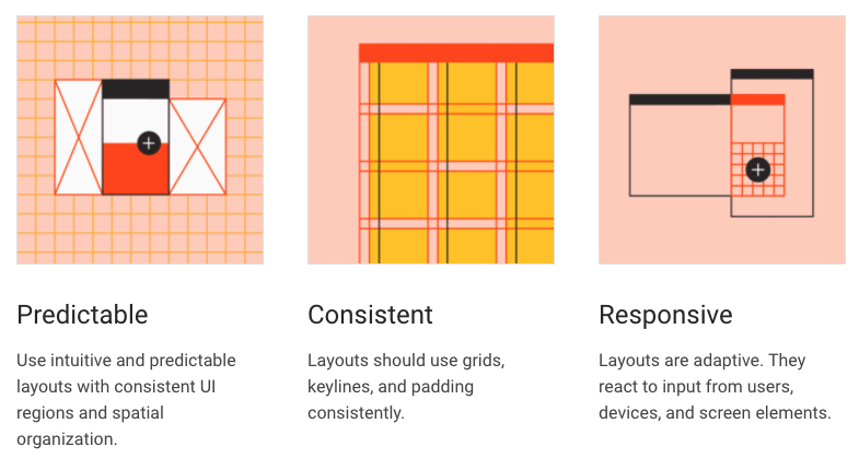
Principles
Material measurements
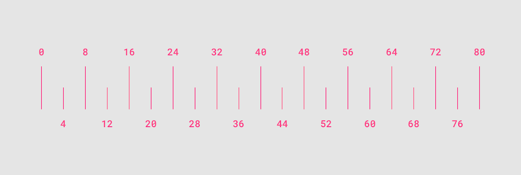
To ensure that Material Design layouts are visually balanced, most measurements align to 8dp, which corresponds to both spacing and the overall layout. Components are sized in 8dp increments, ensuring a consistent visual rhythm across each screen.
Smaller elements, such as icons, can align to a 4dp grid, while typography can fall on a 4dp baseline grid, meaning that each line’s typographic baseline is spaced in increments of 4dp from its neighbor.
8dp and 4dp units Pixel density
Density-independent pixels
Density-independent pixels, written as dp (pronounced "dips"), are flexible units that scale to have uniform dimensions on any screen. They provide a flexible way to...
Density-independent pixels, written as dp (pronounced "dips"), are flexible units that scale to have uniform dimensions on any screen. They provide a flexible way to accommodate a design across platforms.
Material UIs use density-independent pixels to display elements consistently on screens with different densities.
1. Low-density screen displayed with density independence
2. High-density screen displayed with density independenceResponsive layout grid
Material Design’s responsive layout grid adapts to screen size and orientation, ensuring consistency across layouts.
Columns, gutters, and margins
The responsive layout grid is made up of three elements: columns, gutters, and margins.
1. Columns
2. Gutters
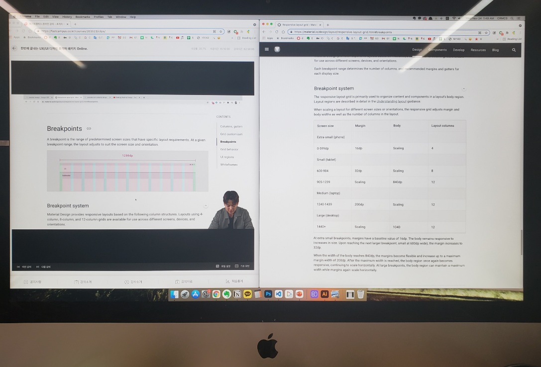
3. MarginsBreakpoints
A breakpoint is the screen size threshold determined by specific layout requirements. At a given breakpoint range, the layout adjusts to suit the screen size and orientation.
Material Design provides responsive layouts based on 4-column, 8-column, and 12-column grids, available for use across different screens, devices, and orientations.
Each breakpoint range determines the number of columns, and recommended margins and gutters for each display size.
Breakpoint system
The responsive layout grid is primarily used to organize content and components in a layout’s body region.
The responsive layout grid is primarily used to organize content and components in a layout’s body region. Layout regions are described in detail in the Understanding layout guidance.
When scaling a layout for different screen sizes or orientations, the responsive grid adjusts margin and body widths as well as the number of columns in the layout.
Screen size Margin Body Layout columns Extra-small (phone) 0-599dp 16dp Scaling 4 Small (tablet) 600-904 32dp Scaling 8 905-1239 Scaling 840dp 12 Medium (laptop) 1240-1439 200dp Scaling 12 Large (desktop) 1440+ Scaling 1040 12 At extra small breakpoints, margins have a baseline value of 16dp. The body remains responsive to increases in size. Upon reaching the next larger breakpoint, small at 600dp wide), the margin increases to 32dp.
When the width of the body reaches 840dp, the margins become flexible and increase up to a maximum margin width of 200dp. After the maximum width is reached, the body region once again becomes responsive, continuing to scale horizontally. At large breakpoints, the body region can maintain a maximum width while margins again scale horizontally.
Spacing methods
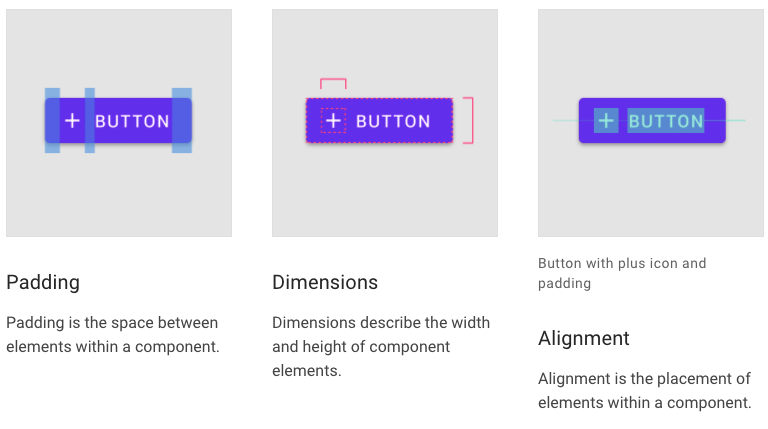
Spacing methods use baseline grids, keylines, padding, and incremental spacing to adjust ratios, containers, and touch targets.
Component behavior
Size constraints
Material Components have minimum and maximum values for container dimensions, margins, and padding. For size constraints of each component, visit the Components section.
For example, snackbars have a maximum width of 600dp for large screens. These minimum and maximum values allow for continuous change to the component’s visual presentation as a layout expands from mobile to large screens.
When scaling a layout, components can have fixed or responsive widths within the range of size constraints.
Elements with responsive widths expand and contract as a screen size changes.
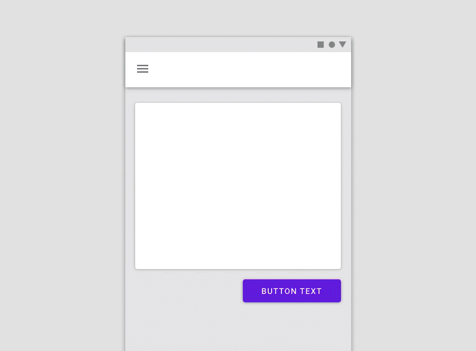
The button scales in response to the two columns on the right side. Reposition
An interface, and the components that comprise it, can reflow or reposition to take advantage of additional screen space.
An interface, and the components that comprise it, can reflow or reposition to take advantage of additional screen space. Repositioning is also a way to address changing ergonomics and input methods on different screen sizes.
Elements in a single-column format can reflow to fill the content area on a larger screen.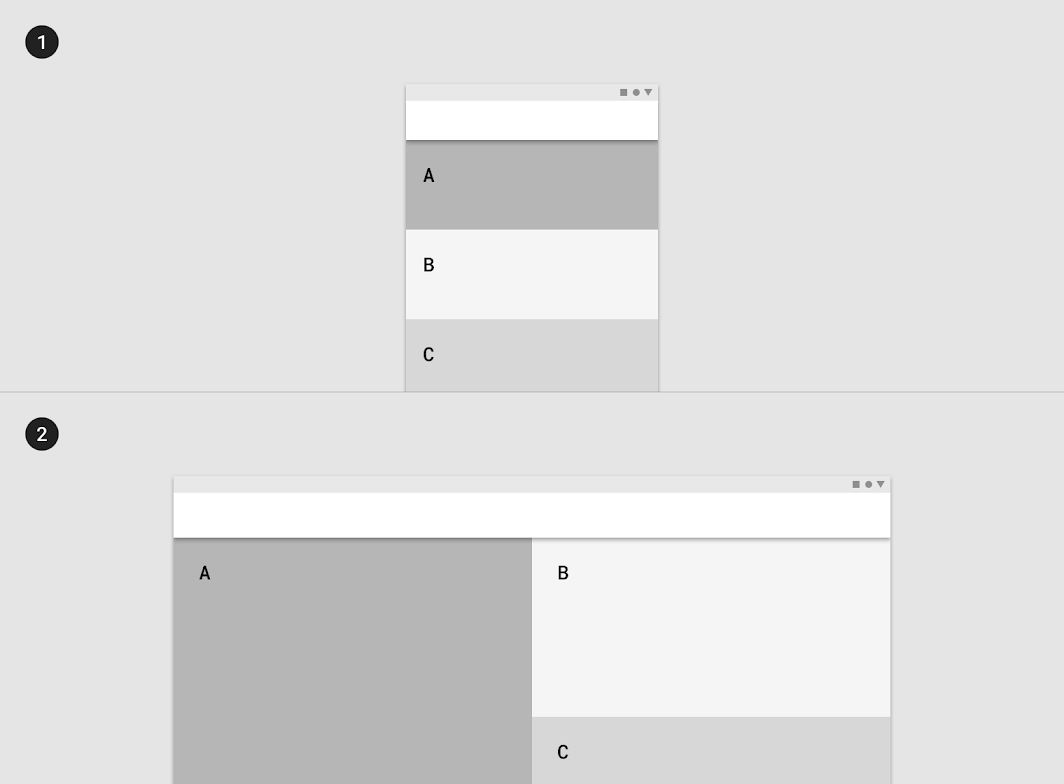 Horizontal tabs can reflow into a vertical list on a larger screen.
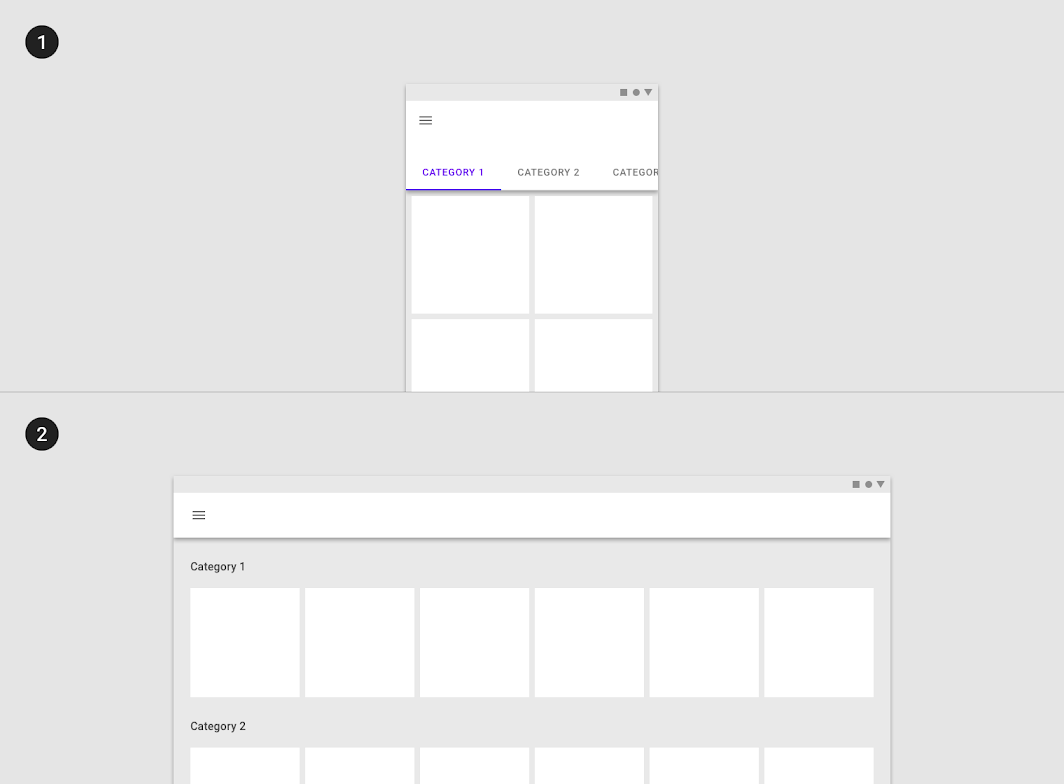 A bottom sheet with menu items on a small screen be swapped for a menu on a larger screen.
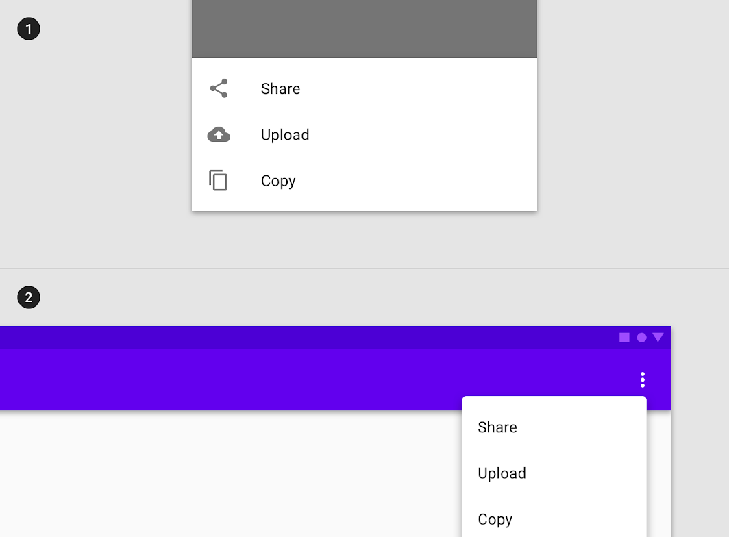 The Floating Action Button can be repositioned to account for the ergonomics of a larger screen.
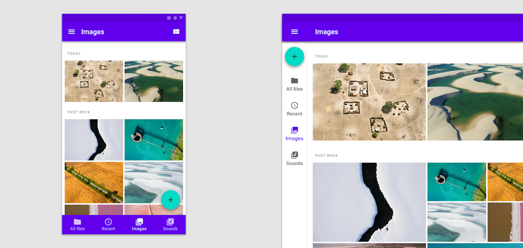
강의수강화면 오늘은 안드로이드OS 매터리얼 디자인의 레이아웃 부분에 대한 강의를 들었다. 안드로이드OS의 레이아웃 디자인은 '예측'이 가능해야하고, '일관성'이 있어야 하고, '반응형'으로 만들어져야 한다는 3가지 원칙을 가지고 있다. 여기서 나는 일관성과 반응형보다 예측이 가능해야 한다는 점이 가장 먼저 등장한다는 것에 주목했다. 안드로이드OS가 왜 상대적으로 사용하기가 쉬운가 하면 바로 예측하기가 쉽기 때문이다.
IT에 친숙하지 않은 일반 사용자들은 버튼을 누르기 전, 입력을 하기 전, 다음으로 넘어가기 전 지금 이 화면에서 어떤 action을 하면 갑자기 내가 모르는 어떤 화면이 등장할 지 모른다는 느낌이 들면 행동을 망설인다. 나는 아이폰이 그런 느낌을 사용자들에게 자주 준다고 생각한다. 화면 뒤에 뭔가 내가 모르는 것이 숨겨져 있는것 같은 느낌. 막연한 불안감 내지 찜찜함을 가지고 실행 버튼을 누르게 되는 것이다.
따라서 그러한 불편감이 기본적으로 배경에 깔려 있는 애플OS를 위한 앱/웹을 디자인할 때 UI디자이너로서 내가 할 일은 최대한 예측이 가능하게끔 화면 구성을 해야겠다는 생각이 든다. 단지 애플에 익숙한 사람들(주로 10-30대)만이 아닌, 더 넓은 범주의 사람들(주로 40대 이상)에게도 이용하기 편리한 디자인을 하고 싶다.
이 포스팅의 위쪽에도 일부 내용을 담았지만, 이 정도는 아주 일부분에 불과할 정도로 구글에서 제공하는 안드로이드OS를 위한 디자인 가이드라인은 매우 방대하다. 디바이스별로 구체적인 여백, 그리드의 숫자값까지 예제 이미지와 함께 표시해놓았다. 이 가이드들을 그대로 따른다면 디자이너가 아이덴티티와 비주얼에 훨씬 더 집중할 수 있게 된다. 이렇게 친절한 작업 가이드를 각 유명 UI 툴들이 얼마나 잘 구현해낼 지, 벌써 궁금하다.
본 포스팅은 패스트캠퍼스 환급 챌린지 참여를 위해 작성되었습니다.
'UX/UI design' 카테고리의 다른 글
Android 앱, 안드로이드OS 디자인의 컬러 이해하기 - 패스트캠퍼스 챌린지 25일차 (0) 2021.11.25 Android 앱, 안드로이드OS 디자인의 네비게이션 이해하기 - 패스트캠퍼스 챌린지 24일차 (0) 2021.11.24 Android 앱, 안드로이드OS 디자인의 환경 요소 이해하기 - 패스트캠퍼스 챌린지 22일차 (0) 2021.11.22 Android 앱, 안드로이드OS 디자인 이해하기, Material Design - 패스트캠퍼스 챌린지 21일차 (0) 2021.11.21 UI 클론디자인 iOS 앱, 프린시플 프로토타이핑 만들기, Sketch 앱 사용법 기초 - 패스트캠퍼스 챌린지 20일차 (0) 2021.11.20