-
Android 앱, 안드로이드OS 디자인의 타이포그래피 이해하기 - 패스트캠퍼스 챌린지 26일차UX/UI design 2021. 11. 26. 16:56
*모든 자료의 출처 : Material Design by Google https://material.io/design/
Material Foundation > Typography
The type system
Example type scale
This example type scale uses the Roboto typeface for all headlines, subtitles, body, and captions, creating a cohesive typography experience. Hierarchy is communicated through differences...
This example type scale uses the Roboto typeface for all headlines, subtitles, body, and captions, creating a cohesive typography experience. Hierarchy is communicated through differences in font weight (Light, Medium, Regular), size, letter spacing, and case.

The Material Design type scale. (Letter spacing values are compatible with Sketch.) Download this Roboto type scale using type styles in Sketch.
DOWNLOAD ROBOTO TYPE SCALEFont size units
The following units are used to express font size on Android, iOS, and the web.

Web browsers calculate the REM (the root em size) based on the root element size. The default for modern web browsers is 16px, so the conversion is SP_SIZE/16 = rem. Understanding typography
Type properties
A typeface is a collection of letters. While each letter is unique, certain shapes are shared across letters. A typeface represents shared patterns across a collection of letters.
Typefaces that are selected for their style, legibility, and readability are most effective when following the fundamental principles of typographic design.

Names of letterform parts: aperture, ascender, baseline, cap height, descender, leading, letter-spacing, sans serif, serif, stem, stroke, x-height Letter-spacing
Letter-spacing, also called tracking, refers to the uniform adjustment of the space between letters in a piece of text.

Larger type sizes, such as headlines, use tighter letter-spacing to improve readability and reduce space between letters.
Tighter letter-spacing
Line length
Line lengths for body text are usually between 40 to 60 characters. In areas with wider line lengths, such as desktop, longer lines that contain...
Line lengths for body text are usually between 40 to 60 characters. In areas with wider line lengths, such as desktop, longer lines that contain up to 120 characters will need an increased line height from 20sp to 24sp.
The ideal line length is 40-60 characters per line for English body text. The ideal line length for short lines of English text is 20-40 characters per line.
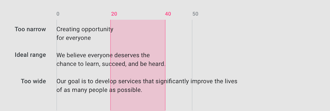
강의수강화면 안드로이드OS에서 영문은 기본적으로 Roboto 폰트를 많이 쓴다. 한글은 Noto Sans KR을 많이 쓴다. 제목 & 부제목을 위한 폰트와 본문 & 설명을 위한 폰트는 서로 다르게 지정할 수 있다. 모바일 본문 폰트 크기의 기본값은 대부분 16px or 17px 이다.
제목 폰트는 글씨 크기가 크기 때문에 자간을 좁히는 경우가 많다. 본문이나 설명 폰트로 갈수록 밀도가 좁아지기 때문에 자간을 넓히는 편이다. 사이트에 나와 있는 영문폰트의 Type Scale 표를 한글화 하는 작업을 나중에 클론디자인에서 함께 하게 될 것이다.
폰트 크기의 단위는 안드로이드는 sp, iOS는 pt, 웹사이트에서는 rem을 주로 사용하는데, 안드로이드의 sp 단위는 화면 크기에 따라 폰트의 크기가 가변적이다. rem 단위는 기준값 1을 정하면 0.06 이런식으로 크기를 설정하게 되는데, 반응형 웹에서 스크린에 따라 바뀌는 폰트 크기 단위가 필요해져서 생겨난 단위다.
글자의 간격을 의미하는 자간에 대해... 예전에 만들어진 폰트들은 글자 사이의 간격을 다르게 설정했었는데, 최근에는 디지털 가독성을 개선하기 위해서 글자 사이의 간격을 좁히고 간격을 균등하게 만든 폰트들이 만들어지고 있다고 한다.
줄바꿈의 기준이 되는 문장의 길이는 문장이 많은 본문의 경우 40자에서 60자 사이에 줄바꿈을 하는 것이 좋고, 문장이 짧은 경우 20자에서 40자 사이에 줄바꿈을 하는 것이 좋다고 권하고 있다.
폰트의 경우 한글 폰트는 구글폰트(https://fonts.google.com/?subset=korean)와 눈누(https://noonnu.cc/)를 많이 이용한다. 갤럭시는 삼성원 폰트(https://design.samsung.com/kr/contents/samsungone_part2)를 많이 쓴다.
본 포스팅은 패스트캠퍼스 환급 챌린지 참여를 위해 작성되었습니다.
'UX/UI design' 카테고리의 다른 글
Android 앱, 안드로이드OS 디자인의 아이콘, 쉐잎 이해하기 - 패스트캠퍼스 챌린지 28일차 (0) 2021.11.28 Android 앱, 안드로이드OS 디자인의 사운드 이해하기 - 패스트캠퍼스 챌린지 27일차 (0) 2021.11.27 Android 앱, 안드로이드OS 디자인의 컬러 이해하기 - 패스트캠퍼스 챌린지 25일차 (0) 2021.11.25 Android 앱, 안드로이드OS 디자인의 네비게이션 이해하기 - 패스트캠퍼스 챌린지 24일차 (0) 2021.11.24 Android 앱, 안드로이드OS 디자인의 레이아웃 이해하기 - 패스트캠퍼스 챌린지 23일차 (0) 2021.11.23