-
UI 클론디자인 iOS 앱, 버튼, 탭 바 만들기, Sketch 앱 사용법 기초 - 패스트캠퍼스 챌린지 17일차UX/UI design 2021. 11. 17. 23:17
Tab Bars
A tab bar appears at the bottom of a screen, helping people understand the types of information or functionality an app provides. Tabs let people quickly switch between top-level sections in your app while preserving the current navigation state within each section.
By default, a tab bar is translucent: It uses a background material only when content appears behind it, removing the material when the view scrolls to the bottom. A tab bar hides when a keyboard is onscreen.
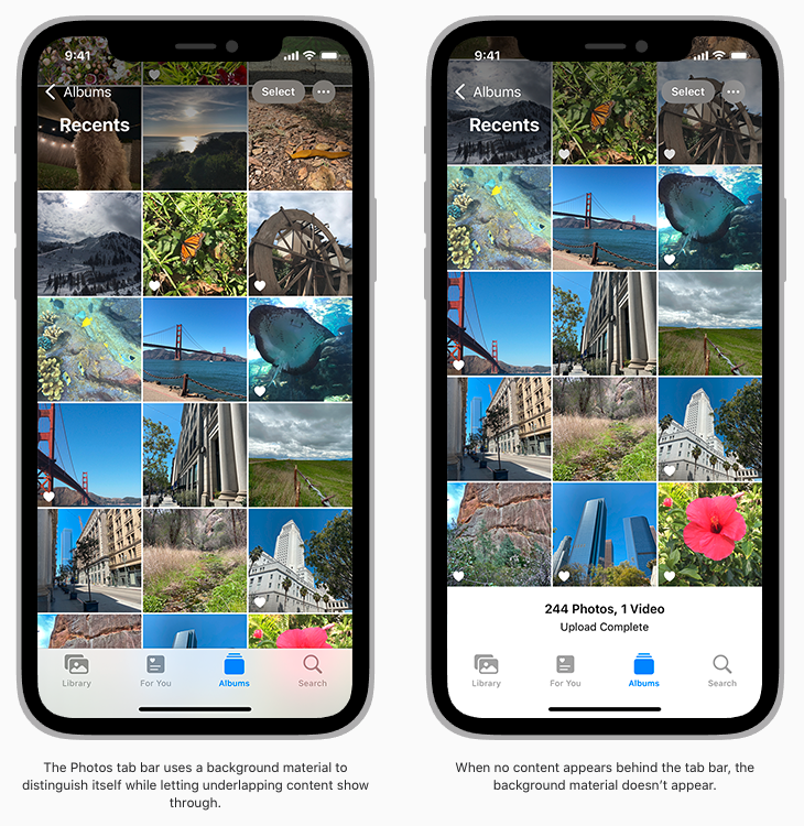
Depending on device size and orientation, the number of visible tabs can be smaller than the total number of tabs. If horizontal space limits the number of visible tabs, the trailing tab becomes a More tab, revealing the remaining items in a list on a separate screen.
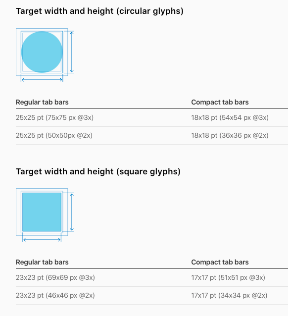
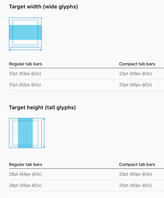
If you need to create custom tab bar glyphs, create each glyph in two sizes so that the tab bar looks good in both regular and compact environments. Use the following metrics when creating tab bar glyphs in different shapes. For guidance, see Glyphs.
* Source: https://developer.apple.com/design/human-interface-guidelines/ios/bars/tab-bars/
_____________________
Tab Bar Icons
Use the following icons in tab bars. For developer guidance, see UITabBarSystemItem.
자주 쓰는 탭바 아이콘들은 아래의 링크에서 가져올 수 있다.
https://developer.apple.com/design/human-interface-guidelines/ios/icons-and-images/system-icons/
System Icons - Icons and Images - iOS - Human Interface Guidelines - Apple Developer
System Icons (iOS 12 and Earlier) In iOS 13 or later, prefer using SF Symbols to represent tasks and types of content in your app. If your app is running in iOS 12 or earlier, follow the guidance below. The system provides built-in icons that represent com
developer.apple.com
강의수강화면 오늘 배운 내용
- Background Blur 기능 - 뒤에 있는 배경이 blur 처리되어 gradient 처럼 비쳐 보이도록 하는 기능
- 레이어에 대해 레이어 모드를 포토샵처럼 변경 가능 (Normal, Overlay, Color, etc.)
- 숫자입력창에서 shift + 화살표 위아래 키로 값을 변경할 수 있다.
- 본문 텍스트와 나란히 사용하는 크기의 아이콘은 18x18px 크기로 작업을 많이 한다.
- 화면 최하단의 Home indicators 추가 방법
- 탭바의 target width and height는 모양에 따라 다르다. (위의 4종 모양별 수치값 참조)
- Tint 기능 : 특정 컬러를 특정 다른 걸러로 한번에 다 변경됨
- Active / Inactive icons 색상값에 차이를 줄 때는 Appearance에서 Style을 설정한다. (instead of Fills)
- 작업 후 미리보기 방법 : 상단 커스텀 툴바에서 Preview 클릭 > 로딩 후 새 창에서 스크롤 가능한 화면이 나타남
- 탭바 고정방법 : 패널에서 Prototyping > Fix position when scrolling에 체크
드디어 첫 페이지 클론디자인 작업이 끝났다. 디테일이 아주 많이 요구되는 작업이라서 모든 강의내용을 다 따라 하지는 못했지만 최소 2~3번씩 복습을 하면서 들었다. 강의에서 가르쳐주는 모든 내용을 다 소화하려다 보니 힘이 좀 들었는데 다른 인강을 열심히 듣고 있는 지인이 강의에서 소화하기가 어려운 내용이 있을 때는 너무 어렵다고 생각하며 힘들게 듣는 대신에 일단은 다음으로 진도를 넘어가라고 조언을 해줬다.
그러고보니 공부는 숲을 보고 나무를 보는 순서대로 해야 한다는 것이 떠올랐다. 한 권의 책읽기를 예로 든다면, 책을 보다 잘 이해되지 않는 내용이 있을 때마다 읽기를 멈추고 찾아 보거나 뒤로 가기를 반복하면 그 책을 완독하기 어렵다. 반대로, 모르는 단어나 표현, 이해하기 어려운 내용이 있더라도 멈추지 않고 계속 읽어 나가면, 완독한 후에는 내가 몰랐던/어려웠던 그 부분이 이해가 되는 것처럼 말이다.
새로운 것을 배우는 사람의 입장에서 '강의에서 말하는 모든 것을 이해하고 숙지하여 내 것으로 만들기를 목표하지 않기로' 했다.
대신 '매일 꾸준히 배우기'를 목표하기로 했다. 꾸준하려면 지치지 않아야 한다.
지치지 않으려면 배우기를 습관으로 만들어야 하고, 배움 속에서 흥미와 만족감을 느껴야 한다.
흥미와 만족감이 떨어지면 배우기를 지속하기가 매우 어려운데, 그럴 때는 책임감, 의무감 등 한시적인 강제성의 노력도 도움이 된다.
그런 점에서 벌써 17일째, 매일 빠짐없이 공부를 해올 수 있게 독려해주는 이 챌린지가 무척 고맙다.
본 포스팅은 패스트캠퍼스 환급 챌린지 참여를 위해 작성되었습니다.
'UX/UI design' 카테고리의 다른 글